Overview
'Back to top' button provides a convenient and efficient way for users to scroll back up to the top of long pages.
The 'back to top' button, is a small button placed at the end of the page on the bottom right. Its purpose is to provide a convenient and efficient way for users to navigate through long pages, without having to manually scroll all the way back to the top.
Back to top
The 'Back to top' button is placed above the footer, aligned to the bottom-right corner of the page within the layout grid. It appears after all content at the end of the
<main>Copy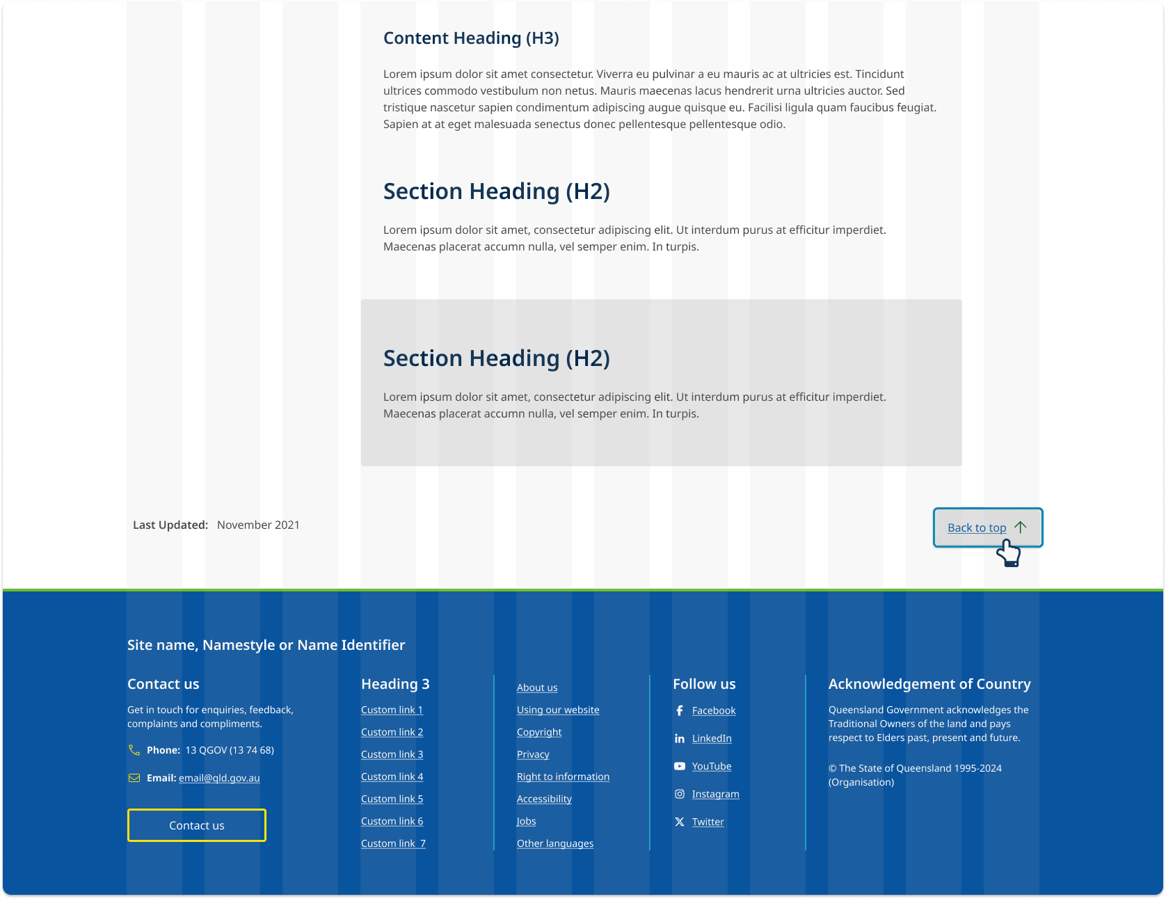
Responsive behaviour
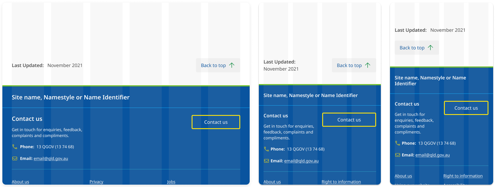
The 'Back to top' button adjusts its position based on screen size to keep the layout clear and easy to use. On screens 400px wide and larger, it stays right-aligned on the same line as the 'Last updated' text. On extra small screens (under 400px wide), it moves below the 'Last updated' text and aligns to the left for better balance.
<a href="#content" class="qld__btn qld__btn--floating qld__btn--back-to-top show" aria-label="Back to top"> <span>Back to top</span> <svg class="qld__icon qld__icon--sm" role="img" aria-hidden="true" focusable="false" xmlns="http://www.w3.org/2000/svg"><use href="./?a=169317:dist/mysource_files/img/QLD-icons.svg#arrow-up"></use></svg> </a>
Usage guidelines
When to use
- Use when pages are long, and scrolling back to the top would be cumbersome. It is recommended for pages that are longer than 4 screens. (Loranger, H 2017)
- Use when there is a lot of content on the page, such as articles, blogs, or listings.
When not to use
- Don't use on pages that are short and can be easily scrolled through in one go.
- Don't use if there is already a way to quickly navigate to the top of the page, such as a fixed in-page navigation menu.
- Don't use if the 'Back to top' button creates confusion or adds unnecessary clutter to the page design.
Research and rationale
That design of our 'back-to-top' component is based on recommendations from the Nielson and Norman group which state that it should be visible but unobtrusive, easy to spot and not distract from the main content of the page. It's best to keep it small, but with a high contrast colour or icon that stands out. (Loranger, H 2017).
Research also suggested that the meaning of the arrow icon alone is too obscure which is why our back to top button includes the words back-to-top as well as an icon (Loranger, H 2017).
Placement of this button is in the bottom right corner, this was the most consistent approach we found across websites that implement this component (Loranger, H 2017).
We originally used a fixed position for the 'Back to top' button so it always appeared in the bottom-right corner of the screen. However, accessibility testing revealed that fixed-position elements can affect users who rely on browser zoom and make it difficult for sighted keyboard users to read or interact with content hidden behind these elements.
To improve accessibility, we repositioned the 'Back to top' button to appear visually where it naturally occurs in the focus order—at the end of the
<main>CopyFuture update
In line with best practices for user experience, as outlined by the Nielsen Norman Group (NNG), we will be updating the current 'Back to top' functionality on this site. Currently, the "Back to top" button uses an anchor link (
<a href="#content"> CopyAs part of our upcoming updates, we plan to transition this functionality to a JavaScript-based solution. This will ensure that when users press the browser’s 'Back' button, they are correctly navigated to the previous page in their browsing history, instead of being taken to the bottom of the current page (Schade A, 2017).
Classes
| Name | Description |
|---|---|
qld__btnCopy | Default class for buttons. |
qld__btn--back-to-topCopy | Modifier that applies back-to-top style. |
Accessible back to top button requirements
Keep these considerations in mind if you're modifying the Design System or creating a custom component.
WCAG guidelines
1.1.1 Non-text Content
Provide a clear label for the button, such as "Back to top," along with a recognisable icon, if necessary (W3C, 2018).
1.4.10 Reflow
Ensure the 'Back to top' button remains fully visible and accessible when users zoom in up to 400% or use mobile and tablet screen sizes. Avoid fixed-positioning that can overlap or hide content, ensuring all page elements reflow naturally and maintain readability.
2.1.1 Keyboard
Ensure the 'Back to top' button is keyboard-accessible by making it focusable and providing a keyboard shortcut if necessary (W3C, 2018).
2.4.7 Focus Visible
Make sure the 'Back to top' button has a visible focus indicator when accessed using a keyboard (W3C, 2018).
3.2.4 Consistent Identification
Maintain a consistent design, appearance, and placement for the 'Back to top' button across all pages of the website.
References
Loranger H (2017) Back-to-Top Button Design Guidelines, Nielsen Norman Group, accessed 10 April 2023.
Schade A (2017) Anchors OK? Re-Assessing In-Page Links, Nielsen Norman Group, accessed 20 Jan 2025.
Material Design 3 (n.d.) Extended FAB Overview, Material Design, accessed 10 April 2023.
W3C (2018) Web Content Accessibility Guidelines (WCAG) 2.1, World Wide Web Consortium, accessed 10 April 2023.